Component · content
Liquid glass app icon
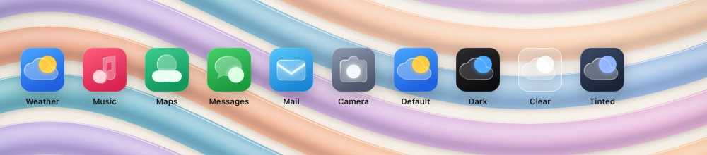
App or feature icon in the glass style.
Also called app tile
Spec
- Material
- layered glass (Icon Composer style): translucent foreground shapes over a colour or clear background
- Profile
- convex
- Geometry
- squircle icon grid (iOS 1024 master, continuous corners); 2–3 layers
- Bezel (px)
- 8–12 % of size
- Displacement (px)
- light
- Blur (px)
- 0–2
Anatomy
- background layer
- glass foreground layers with specular edges
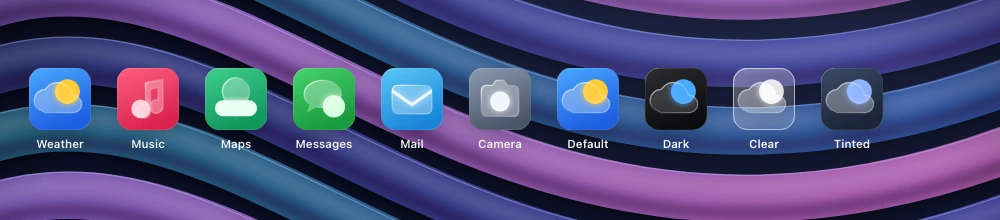
- optional dark/clear/tinted variants
States
- default
- dark
- clear
- tinted
Rules
- Specular highlight on top-left edges of each layer; keep shapes simple and bold.
- Current generation: 2–4 glass layers, each may refract what is under it; design every appearance — default, dark, clear (light and dark) and tinted (light and dark).