Component · controls
Liquid glass card
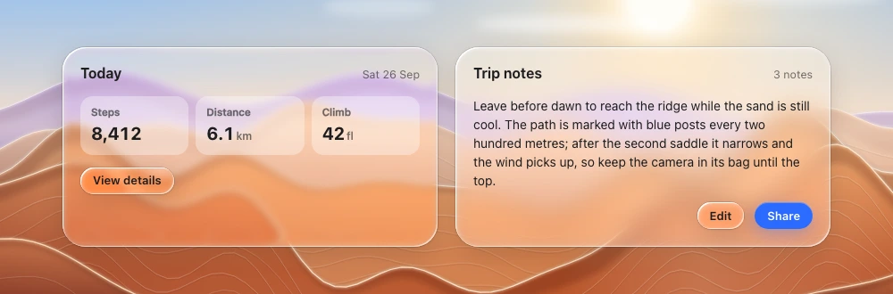
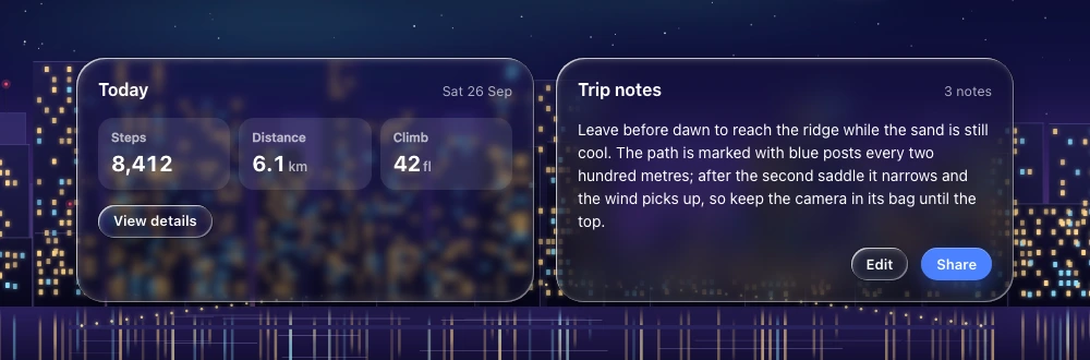
Grouping surface in the controls/overlay layer (settings group, playground card, widget panel).
Also called panel, tile
Spec
- Material
- regular · frost when it carries 3+ lines of body text, a form, or a long list
- Profile
- squircle
- Geometry
- radius 24–28, padding 16–22
- Bezel (px)
- 24–28
- Displacement (px)
- 60–75
- Blur (px)
- 2–6 regular / 10–20 frost
Anatomy
- glass panel
- flat content: headings, rows, flat inputs or separate small lenses with gaps
States
- rest
- drag (if draggable): lifts with stronger shadow
Rules
- Do not use glass cards for feed/content items — content stays in the content layer.
- Controls inside a card are separate bodies (lens buttons, trough inputs), not a card-in-card.
- Stat tiles, chips and badges inside the card are flat fills (white/black 8–12 %), not glass.