Component · controls (floating inset panel)
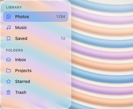
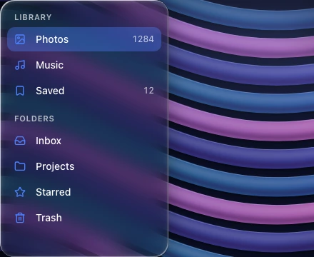
Liquid glass sidebar
Persistent navigation on large screens.
Also called side navigation, drawer nav, source list
Spec
- Material
- frost
- Profile
- squircle
- Geometry
- full-height column flush with the window's leading edge (current generation), width 240–300, continuous corner only where it meets the window corner; the first generation floated it as an inset panel, radius 24–28, 8–12 from the window edges
- Bezel (px)
- 24
- Displacement (px)
- 50–60
- Blur (px)
- 12–20
Anatomy
- frosted panel
- flat rows 32–36 tall
- selected row: tint pill
States
- rest
- row hover
- row selected
Rules
- Content behind it (e.g. a hero image) should extend under the sidebar.
- Row icons carry the app's accent colour; the selected row is a tint or lens pill inset 8 from the column edges.